Fonts allow websites to create visual appeal and convey brand identity. It is essential in creating an effective and visually appealing website because it helps establish an overall style, tone, and mood. They can also help make a website easier to read, leading to an improved user experience and higher engagement. Fonts also help to create a sense of continuity, making it easier for users to recognize a website and return to it.
The thing is there are hundreds and thousands of Fonts available. That’s a lot of choices. So, you need some help in finding the best fonts for your website. We have compiled for you a list of the best Fonts to use for websites.
Selecting a font is much more than just an aesthetic choice- it may have a substantial effect on your conversion rates and site’s bounce rates, especially if you pick a font that’s difficult to read. Therefore, it pays to take some time to choose the best font for your website, rather than simply using any font that you first come across.
To help you identify the font that you can choose for your design, we have handpicked some really nice web fonts that you can use free of cost. It will definitely expedite your web design process. Most of these fonts are available in the Google fonts library. So, if you choose visual page builders such as Elementor or Divi, you can easily find them.
List of Best Free Fonts for Websites in March 2026
Segoe UI
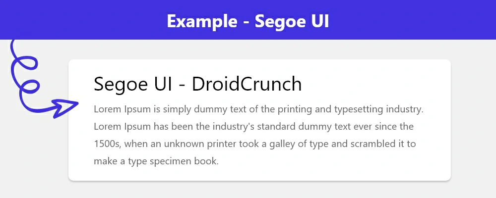
Segoe UI is a user interface font and typeface. Microsoft created it and published it in 2007. Segoe UI is the default typeface in Microsoft products and services such as Office, Xbox, Windows, and Windows Phone. It is used in Microsoft products’ menus, dialogues, and other graphical user interface components.
Roboto
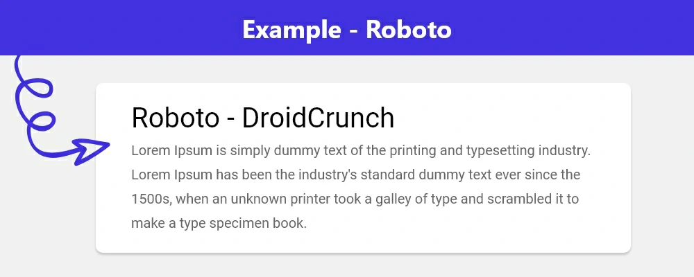
Roboto is a sans-serif font created by Google and introduced for Android smartphones in 2011. It was designed to be a contemporary, welcoming typeface that is easy to read on mobile and digital devices.
It is an open-source typeface with several styles. Roboto has been widely embraced in the Android operating system and is currently found in a variety of digital products such as websites, applications, and digital periodicals.
Open Sans
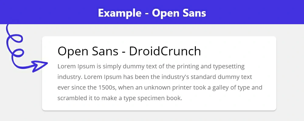
Steve Matteson developed Open Sans; a sans-serif typeface commissioned by Google. It is an open-source typeface family licensed under the SIL Open Font License. Open Sans is a humanist sans-serif typeface designed to be legible across print, online, and mobile interfaces.
It has a neutral, yet welcoming appearance and may be used for a variety of purposes. Open Sans is a very readable and adaptable font with a big x-height, open shapes, and a neutral look. It comes in a variety of weights and styles, including regular, bold, italic, and light.
Lato
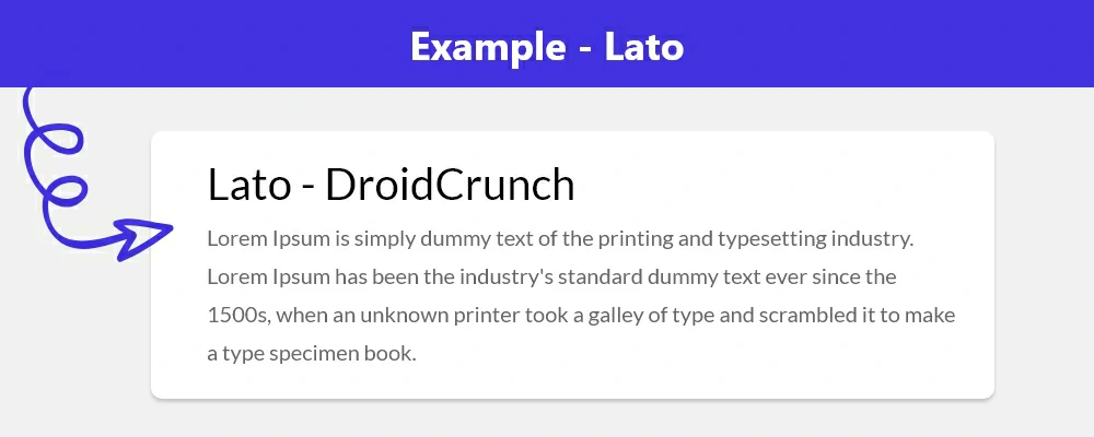
Lato is another great choice from Lukasz Dziedzic. This font has some interesting story behind its design, balancing conflicting aims, resulting in a quite lightweight, unique sans-serif font.
Inter
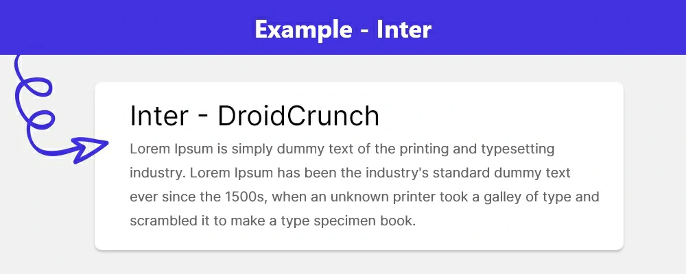
Rasmus Andersson created and published Inter, an open-source font. It is a sans-serif font family containing 8 weights and 2 widths, as well as Roman and Italic styles. It was built with readability and consistency in mind, and it works well on screens and at tiny sizes.
Inter is designed for user interfaces but may be used for print, online, and mobile applications. It has been tested and optimized for several languages, including Latin, Cyrillic, Greek, and Hebrew.
Carme
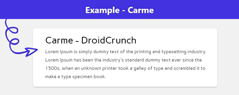
Pablo Cosgaya developed Carme, a contemporary sans-serif typeface. It is a flexible font family that comes in a variety of weights and styles. Carme has a modern air to it thanks to its clean, geometric lines and consistent contours.
The typeface is appropriate for a wide range of design tasks, such as headlines, logos, and body text. Carme is available in both TrueType and OpenType formats and is multilingual.
Oswald
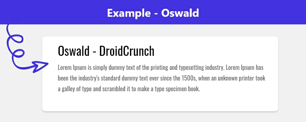
Oswald is also a sans-serif font that was originally developed by Vernon Adams. The font was designed while keeping the Alternate Gothic style in head, which was made evident by its bold strokes.
Raleway
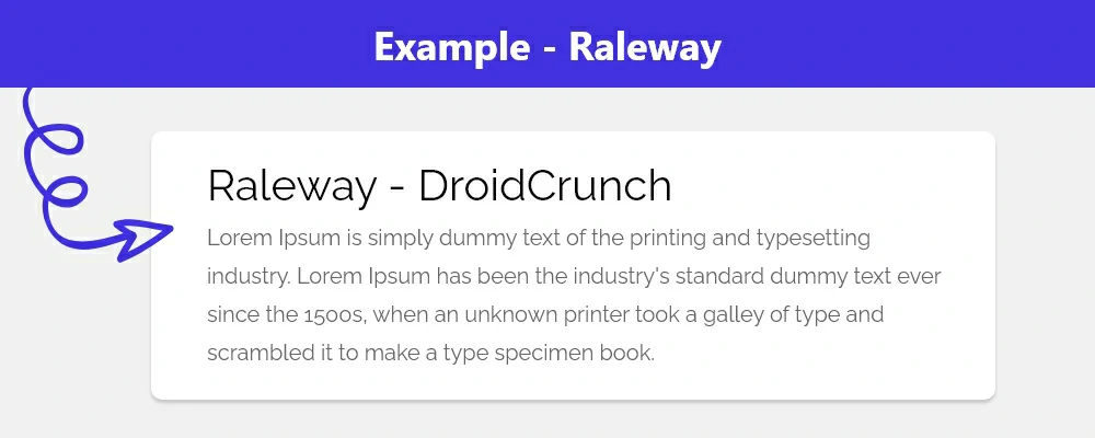
Raleway is a large family sans-serif font having 18 different styles, initially made by Matt Mclnerney. If you love this family and are searching for something unique, then Raleway Dots provides a similar design with a dotted approach that can work nicely for big headlines.
Karla
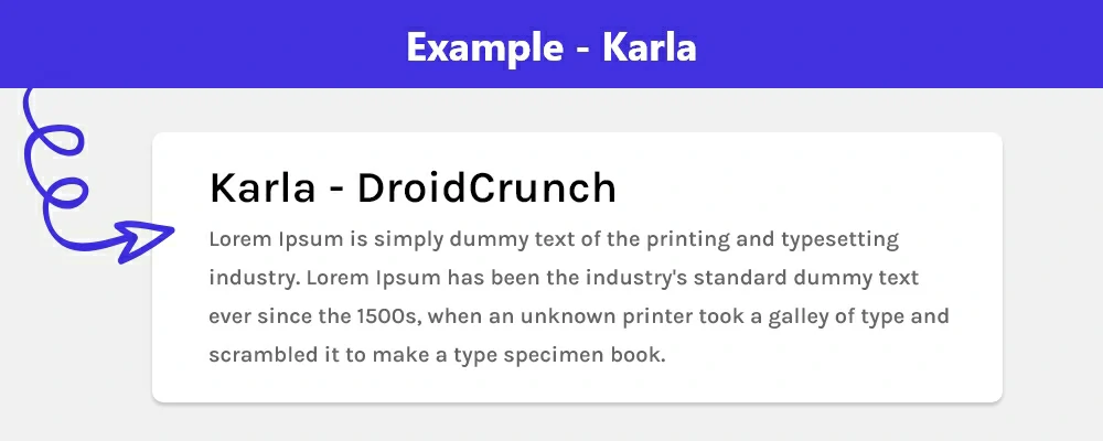
Jonathan Pinhorn developed Karla, an open-source sans-serif typeface distributed under the Open Font License. It was created as a screen-optimized variant of Carlito, a font made by the same designer for Microsoft Office, for Google Fonts.
Karla comes with good legibility and low contrast. It features a big x-height and a slightly condensed feel, as well as a pretty wide spectrum of weights ranging from thin to black. It is a very adaptable typeface that works well in both large and small sizes and for a wide range of applications.
Jost
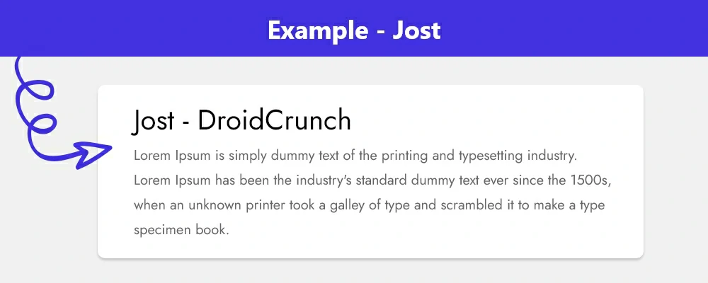
Jan Fromm created the modern font family Jost. It features a classic yet contemporary appearance that is influenced by old Swiss fonts. It has a huge x-height, which makes it very legible, and its character forms are gently rounded, giving it a pleasant appearance.
Jost is well-suited for a variety of applications, including display and branding, as well as editorial and online design. It offers a variety of OpenType features like as tiny capitals, ligatures, fractions, alternates, and an arrow set.
Georgia
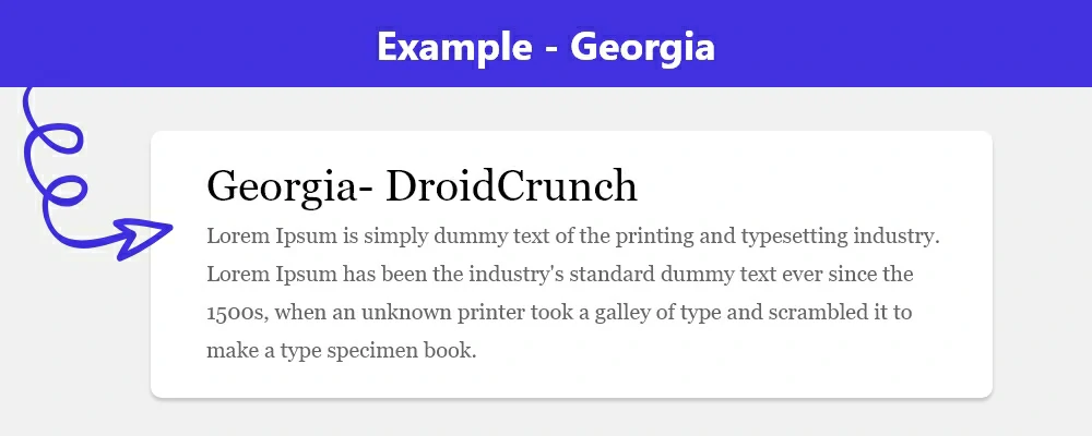
Georgia is a serif typeface developed by Matthew Carter that was introduced by Microsoft. It is a slab serif transitional typeface that is based on the Times New Roman typeface family. Georgia has a big x-height and moderate stroke contrast, making it a very readable typeface.
This typeface is widely used in print and online design, and it is the default typeface in Microsoft Office, Windows, and Apple’s macOS.
Poppins
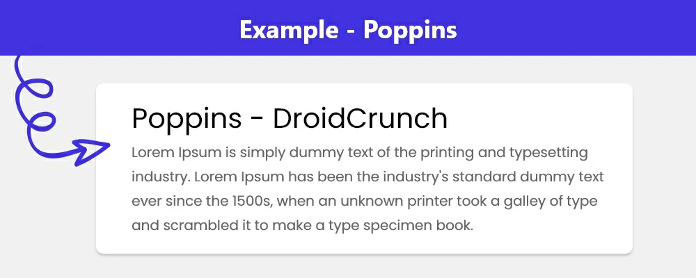
Indian Type Foundry created the sans-serif font Poppins. It is a geometric sans-serif typeface with a modern appearance and feels. The font’s structure is balanced and harmonic, and it was created to perform well in both print and digital projects.
It comes in eight weights ranging from Light to ExtraBold and supports Latin, Devanagari, and Gujarati characters. Poppins is a multi-purpose typeface that may be used for both display and text.
Montserrat
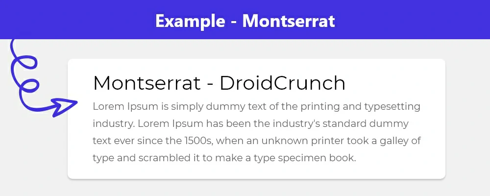
Montserrat is another sans-serif font from Julieta Ulanovsky, who is a resident of eponymous Montserrat next to Buenos Aires. With a range of 18 different styles from light to heavy, you get various choices.
Droid Sans
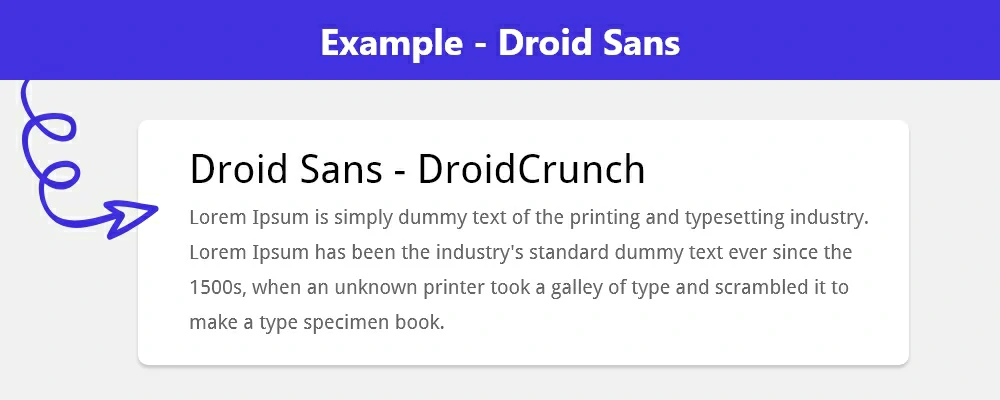
Steve Matteson created Droid Sans, a humanist sans-serif typeface for Google Android. It was initially introduced with Android 2.2 Froyo and is now the official typeface for all Android versions.
Droid Sans features a high x-height, an open aperture, and a big character set. It is also screen readability optimized, making it excellent for mobile devices. The typeface comes in TrueType and OpenType versions.
Nunito Sans
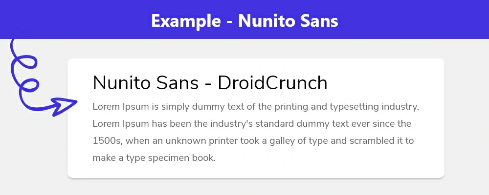
Nuntino Sans is an amazing sans-serif font option that is growing rapidly in its popularity. Between 2018 and 2019, the use of this font has tripled, and it is getting more and more popular with every single year passing.
Josefin Sans
Santiago Orozco created Josefin Sans, a sans-serif typeface. It is a geometric monoline typeface with a large x-height and open counter letterforms. It comes in a wide range of weights, including light, extra-light, normal, medium, semi-bold, bold, and extra-bold, as well as a monospace form.
All styles have a comprehensive variety of accents and ligatures. It is available in TrueType and OpenType formats and may be used for a wide range of applications.
Oxygen
Oxygen is an open-source typeface family created by the KDE project that includes two sans-serif fonts: Oxygen Sans and Oxygen Mono. The typefaces are intended for usage in user interfaces and are optimized for screen readability and legibility.
The family is available in five weights and italic styles: light, normal, medium, bold, and black. Each weight has a diverse set of glyphs, such as Latin, Greek, Cyrillic, and Hebrew letters, as well as symbols and arrows. Oxygen was created to complement other types, notably those from the Google Fonts library. The family is available for free download and usage on any platform.
IBM Plex Sans
IBM Plex Sans is a free and open-source font created by IBM. It is a sans-serif typeface inspired by IBM’s letterforms from the mid-twentieth century. The typeface comes in eight weights, ranging from Thin to ExtraBlack, with corresponding italics.
It is developed for usage in digital contexts and is meant to be readily legible on displays of any size. The font family supports a variety of languages and contains a collection of symbols and icons.
Noto Sans
Noto Sans is a Google-commissioned font that comes in both sans-serif and serif versions. The font is getting updated regularly, and now there are over 100 Noto fonts available, with a lot more coming soon.
The goal of Noto Sans is to cover all the characters and alphabets from many different languages while its unique design is harmonious across as many as hundreds of font families (all different). These derivatives include the famous Noto Sans JP and Noto Sans KR.
Work Sans
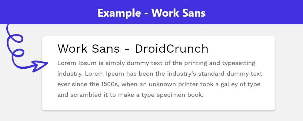
Work Sans is another sans-serif font that is optimized for screen use. The designers suggest using the middleweight styles mostly for something that is from 14px-48px.
FAQs
What should developers look for in a website font?
As a developer, prioritize font readability and accessibility at various sizes for all users. Ensure it aligns with the brand style and website theme. Critically, check web compatibility, file size for fast loading, and licensing for web use. Also, verify the font includes all necessary characters and offers sufficient style variations for your design flexibility.
What are some attractive fonts for a website?
Google Fonts offers many popular, free choices known for readability and style. Highly-regarded options include sans-serifs like Roboto, Open Sans, Lato, Montserrat, and Poppins. For serif fonts, consider Merriweather or Playfair Display. These are widely used by developers for their versatility and clean design, enhancing user experience on websites and apps.
Sources and related content
Are these free fonts suitable for commercial projects?
Generally, yes. Fonts from repositories like Google Fonts typically use licenses permitting free commercial use (e.g., SIL Open Font License). However, as a developer, it is vital to always verify the specific license terms for each font before deploying it on a live commercial website to ensure full compliance.
How do developers typically add these fonts to a website?
Integrating these fonts usually involves linking a stylesheet provided by the font source (like Google Fonts) in your HTML <head>, or using a CSS @import rule. You then apply the font to your HTML elements using the font-family CSS property, specifying the chosen font name in your stylesheets.
Can using many custom fonts negatively impact website performance?
Yes, loading numerous font files or styles can increase page load times. To optimize, developers should only request the specific font weights and styles needed for the design. Using modern formats like WOFF2 and limiting the total number of distinct font families also helps maintain faster performance for your users.
What’s the main difference developers should know between serif and sans-serif?
Serif fonts feature small decorative strokes at the ends of characters (like Times New Roman), often favoured for readability in long text blocks. Sans-serif fonts (like Arial or Roboto) lack these strokes, providing a cleaner, more modern look commonly used by developers for web interfaces, headlines, and digital displays.
How many different font families should be used on a single website?
For optimal performance and design cohesion, developers should generally stick to using just two or three font families per website. Often, one font for headings and another for body text provides enough contrast and hierarchy without negatively impacting load times or creating a visually cluttered user experience for your site visitors.
Over to you
Fonts are an important part of website design. They contribute to the overall look and feel of the site and provide clarity and readability. Fonts can be used to create a sense of hierarchy, direct users to important information, and create a visually appealing and uniform layout. It can also be used to convey a message or to create a sense of personality and brand identity.
Eventually, the right font choice can help ensure that a website looks professional, inviting, and visually appealing.
Listed above are some of the top fonts that one can use on websites free of cost. Hope this article helped you choose the right one for your web project.


